April 2022
A logo is worth a thousand words
In the late summer of 2021, the Holstebro-based Actona Company changed their name to Actona Group to better suit their identity as a global company with several subsidiaries. But despite their growing size, as a strictly B2B supplier, the company was facing the challenge that the average person did not know who they are and what they do.
So, when it became necessary to update their logo to fit the name change, Actona Group decided to look into how the new logo could better illustrate who they are as a company and what they have to offer.
The biggest challenge was that potential customers were not immediately aware that Actona is a furniture supplier when seeing their logo for the first time. To a business whose networking activities revolve heavily around trade fairs, it is important that potential customers can easily decode what the company has to offer when passing their exhibition stand. However, it was important to Actona to preserve the company DNA in the new logo: "The name Actona is a combination of the words Act on A and is an expression of the company DNA. We take action on things, and we want to continue to express that in our visual identity. That is why we have kept the red A in our name in the new logo," explains Helle Bjerre Drost, VP Marketing & Communication, Actona Group.

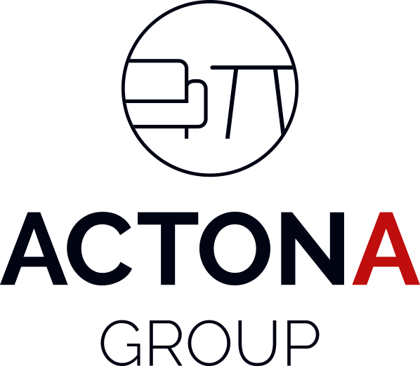
The new logo was developed in a collaboration between in-house resources and in consultation with an external advisor, and the final result comprises the name Actona Group with the characteristic red A along with an icon conveying a sofa and a table to illustrate the core competence of Actona Group as a furniture supplier.
The new logo was launched at the MOW trade fair in Germany in autumn 2021 and shared on Actona Group’s social media platforms and has received very positive feedback.

